A web app and extension for effortless article highlighting and saving

Introduction
Markup is a tool that empowers users to highlight their favorite articles and save them to personal lists. This project focuses on redesigning Markup's web app and browser extension with the goal of expanding the user base and boosting user adoption and engagement.
My Role
UX/UI Designer
(Sole Designer)
Collaborators
Product Manager
Developers
Data Analyst
Marketing
Timeline
7 months
Company
KDAN
Problem
Markup aims to enhance users' reading experience by providing them with an easy-to-use tool. However, the previous design did not effectively meet their needs, such as providing an intuitive and user-friendly navigation.
These are the factors may have caused the problem:
Poor information architecture without clear hierarchy
Cluttered design interface that decreases readability
Confusing and unexpected user interactions
Insufficient guides or instructions, particularly for new users
Additionally, we suspect that an inconsistent brand identity may also have negatively impacted the product's promotion.

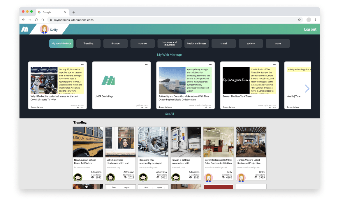
Old interfaces of web app and browser extension
Design Solution
The redesigned Markup tool now offers a seamless and effortless experience for users when it comes to highlighting and saving their favorite articles. It provides smooth navigation and an intuitive interface, enhancing the overall user experience.
The New Web App Experience
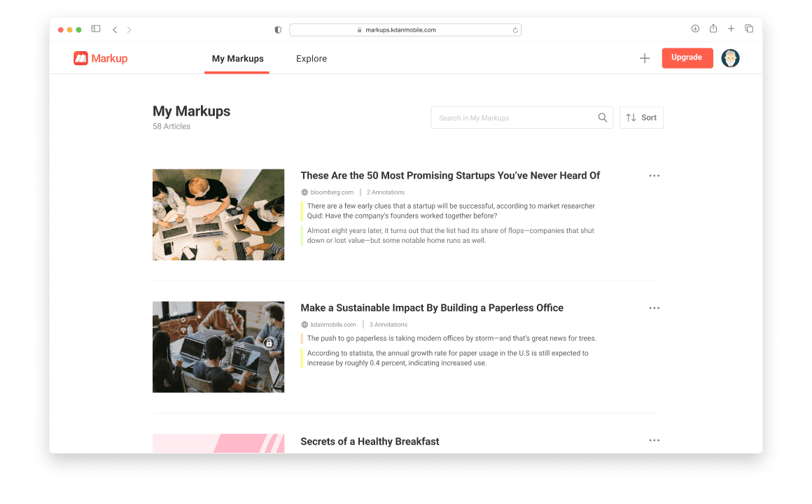
Markup's new web app offers users an intuitive experience for saving and highlighting articles, with its simple and well-structured layout. Users can effortlessly find and read articles through a hierarchical structure and easy-to-read information layout.
Web App, Before
Web App, After
Transformative design of Markup's browser extension
The redesigned Markup browser extension offers an easy-to-use experience, allowing users to easily highlight and save their favorite articles while reading online. These articles are stored in their personal list, and users can effortlessly access the web app through the panel to locate them.

Web App, Before

Web App, After

Impacts

The user base of the browser extension increased by an impressive 27% within just one month.

The user base of the web app saw a notable 13% increase within just one month.

The new browser extension has been recognized with the Featured badge on the Chrome Web Store.
Current Product Auditing
During the beginning stage of redesigning, Hallway Usability Tests were conducted internally among 4-5 staffs who were not participle in product development, using the old design to gather quick feedback and identify areas of confusion.
Several issues were identified:
They discovered that the information was structured differently from their expectations.
Some elements of the user interface were deemed unclear and difficult to understand.
The interaction proved to be confusing that required more time to understand than initially estimated.

Old designs for Hallway Usability Test
Design Goals

Structured Hierarchy
To create a clear hierarchical structure that simplifies user navigation and makes it effortless to locate information.

Information Proximity
To place related elements in close proximity, enabling users to easily identify and understand information groupings.

Brand Consistency
To ensured a consistent brand identity throughout the Markup tool, reinforcing its recognition and trustworthiness.
Learnings from Beta launch
To ensure a quick validation of the issues we had identified, a rapid design update was implemented to vet out early assumption. We made a few key changes and our decision was based on the findings from our audit. We focused on adjusting the structure, information layout, and interface design of the browser extension in this launch.
About 3-4 months after launching the update, we collected user feedback through customer support interactions and reviews. To our surprise, some of our assumptions didn't match the actual user feedback we received.
For instance, the changes we made to the design had unintended negative impacts on the online reader's experience, and some aspects of how we presented information were not easily comprehensible to users.

Information Architecture Restructuring
During the beta launch of browser extension, we identified a need to reorganize the information architecture of the old web app. Subsequently, the Product Manager and I collaborated on revamping the categorization and classification of information, grouping it based on primary user scenarios.
For instance, in the previous design, platform-recommended content was intermingled with user-generated content, leading to user confusion. In the new design, we have separated them into the 'explore page' and 'my personal page,' resulting in a more user-friendly and organized layout.
The primary deliverable at this stage is the enhanced information architecture. Additionally, I have color-coded the information to ensure that the entire team is aligned with the actual improvements.

Old Information Architecture

New Information Architecture
Solving the user engagement problem
By implementing the new information architecture, we have effectively prioritized and highlighted specific features for easy discovery and use. Also, we have expanded user scenarios to enrich the online reading experience. This enhancement has had a positive impact on the online reading experience and user engagement.
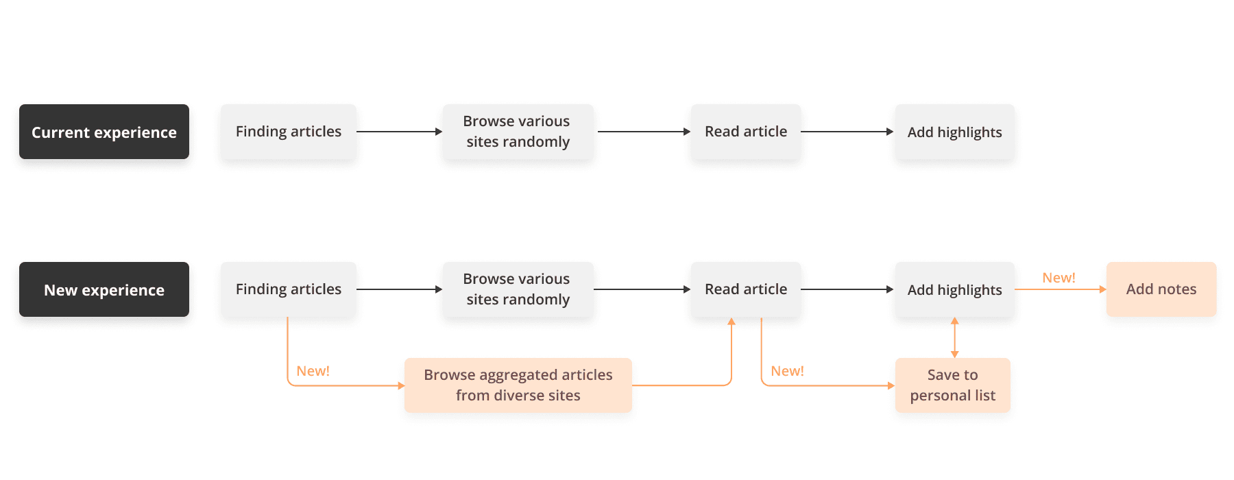
Ideating the Concept
At the ideation stage, I came up with multiple ideas to search for possible design solutions.
These are the approaches I experimented during the process:
Utilizing various UI components
Adding visual hierarchy to the interface
Trying different information layouts
Considering layout scanning patterns

Screen Flows
In the new design, I've labeled the main menu features with text and introduced a hierarchical structure. This ensures that users can easily navigate between pages, minimizing any potential confusion and preventing information overload. Furthermore, users can effortlessly access the web app and locate their saved articles.

Design System
I've established a design system to promote design unity, encourage collaboration among designers, developers, and stakeholders, and enhance efficiency for future iterations.

Design Tradeoffs
In the Markup web app, the Explore page is designed to aggregate articles from various websites and categorize them, making it easier for online readers to find articles of interest. However, during the development process, our engineers discovered that displaying article content on the article preview cards would significantly slow down the web app's loading time. Implementing this design would require additional time for technical research, potentially affecting the product's release timeline. As a result, I had to make a compromise between loading performance and the ideal design.
After discussing with the Product Manager and engineers, we decided to deprioritize the feature of displaying article content, so the initial version of the article card design would not include 'article content previews.' While this design wasn't ideal, it ensured that we could meet the product release schedule.
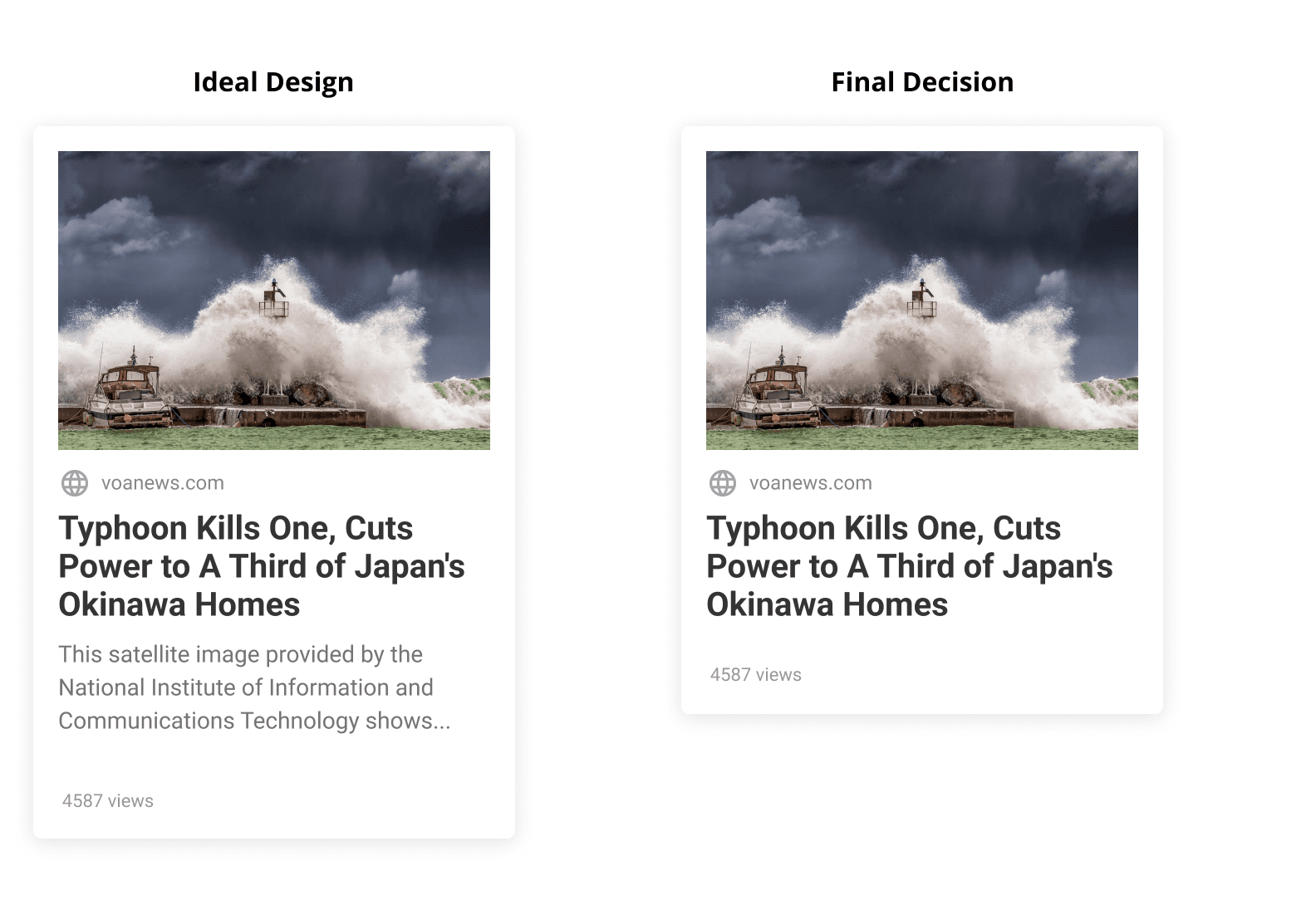
Final Design
Save to personal list
We've created a structured visual layout for saved articles, ensuring they are displayed clearly and are easy to locate.
Add highlights
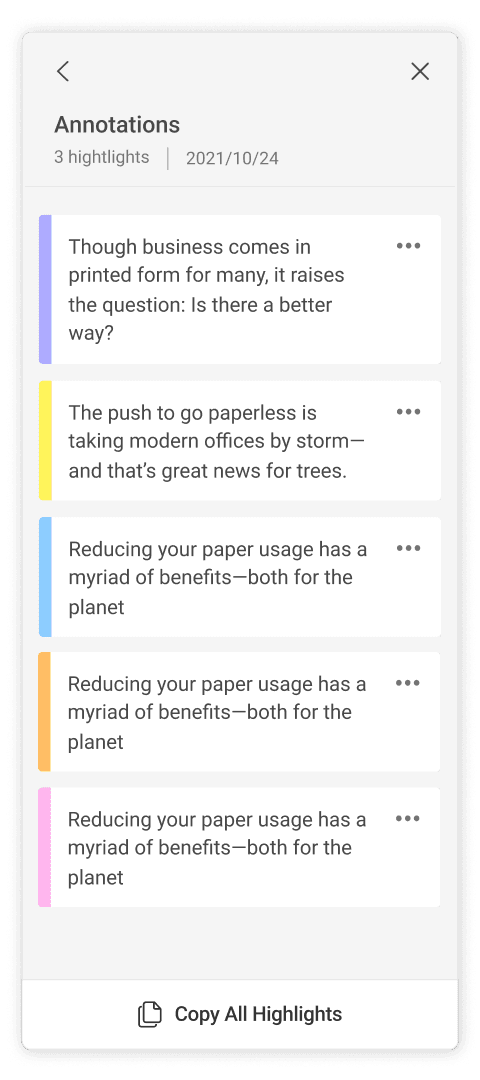
We've refined highlight colors to maintain visual balance. Additionally, an instructional prompt appears when the list is empty, guiding users to create their first annotation.

Add notes
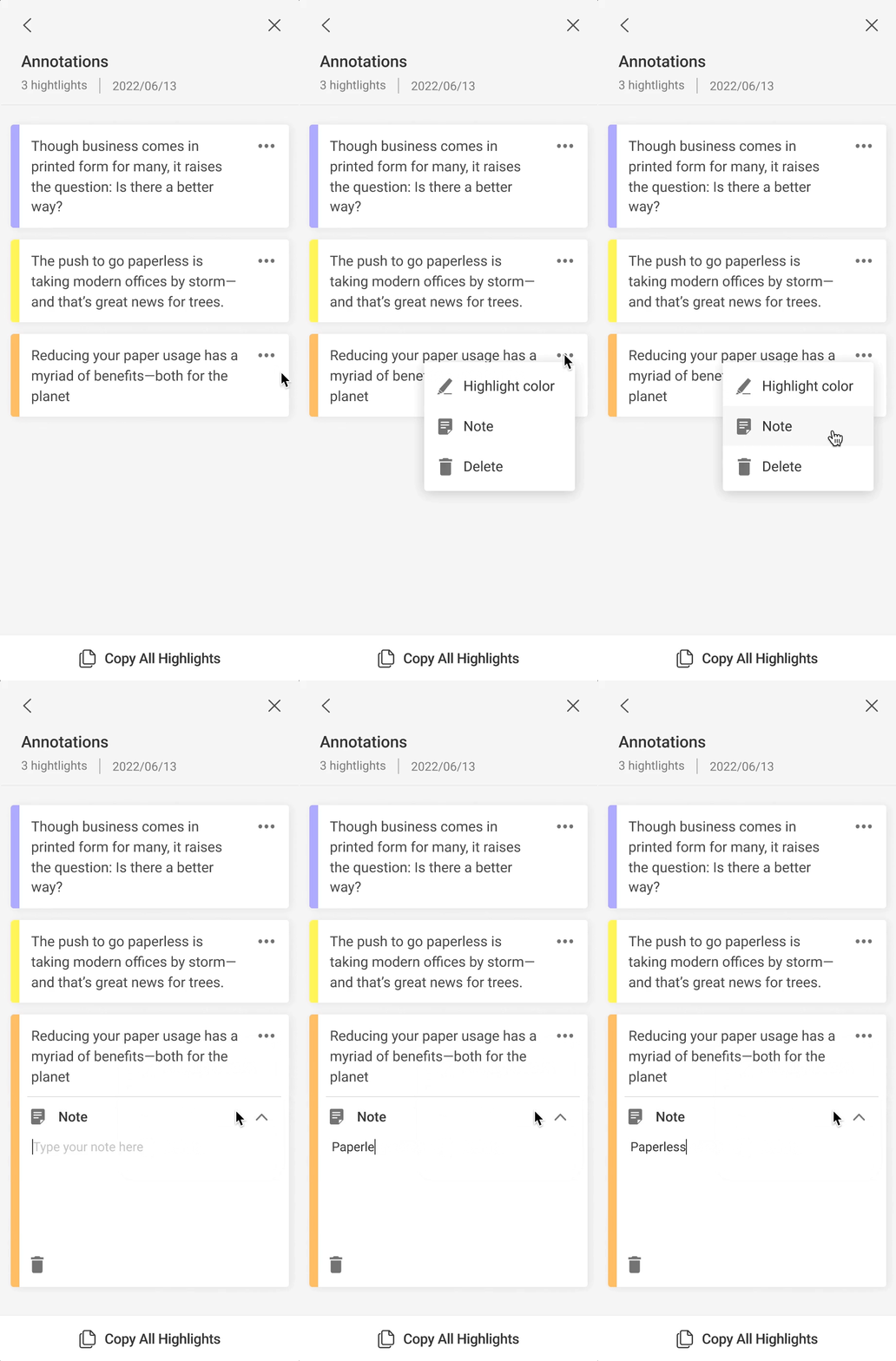
Introducing the 'Annotation Note' feature enhances the annotating experience, allowing users to effortlessly save their thoughts and ideas.
What I have learned...
Testing is crucial in product development
While we couldn't conduct user testing before the initial launch due to time constraints, our quick launch revealed potential issues that could have negatively affected the product. From this experience, I've learned that testing plays a vital role in the product development process to ensure a solution aligns with user needs and expectations.