Effortlessly navigate video editing with the new onboarding experience

Introduction
Write-on Video empowers aspiring video editors to effortlessly create captivating storytelling videos, even if they're just starting their journey. This project focuses on revamping the onboarding experience to streamline the learning process and boost user retention.
My Role
UX/UI Designer
(Sole Designer)
Collaborators
Product Manager
Developers
Data Analyst
Marketing
Timeline
6 weeks
Company
KDAN
Problem
Users are abandoning our app due to difficulty understanding the video project creation process.
65% of new users are unable to complete their first video project within the app
User feedback has revealed that new users find the project creation process to be confusing and overwhelming.
Our design challenge is — to redesign the onboarding experience to help new users understand the project creation process quickly.

Design Solution
By offering a seamless onboarding experience accompanied by step-by-step guide that encourages users to engage in practical actions, the learning process becomes effortless for newcomers.
Design Highlights
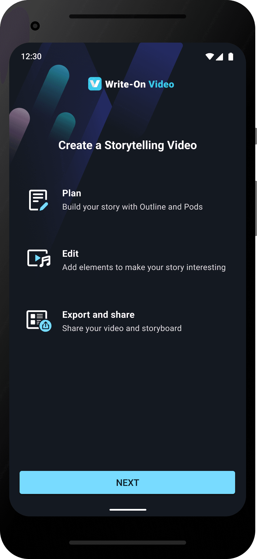
Product Value and Pre-guide
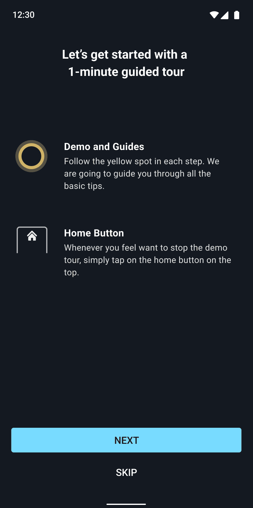
At the start of the onboarding flow, we effectively deliver product value to new users. Additionally, a pre-guide screen helps users understand how the step-by-step guide tour works.


Step-by-Step Guide
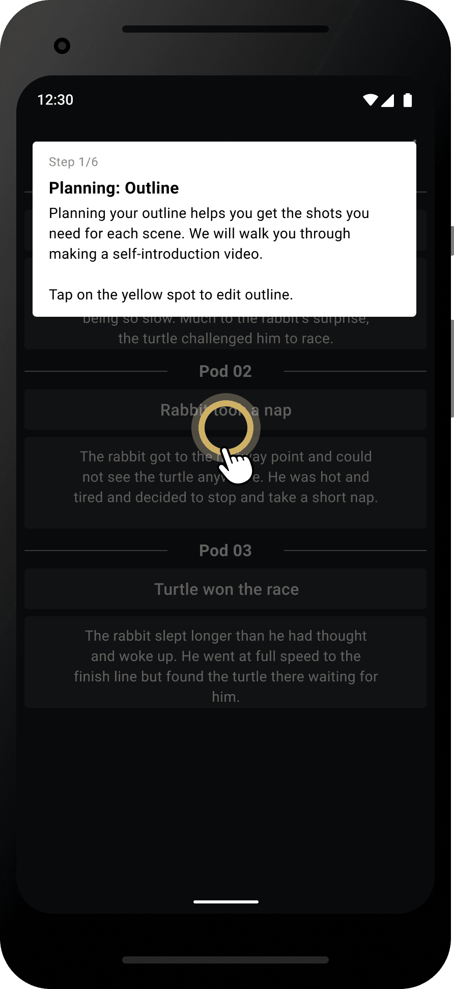
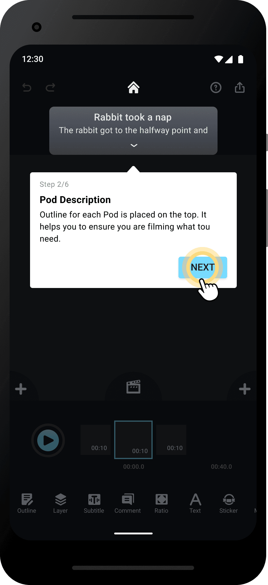
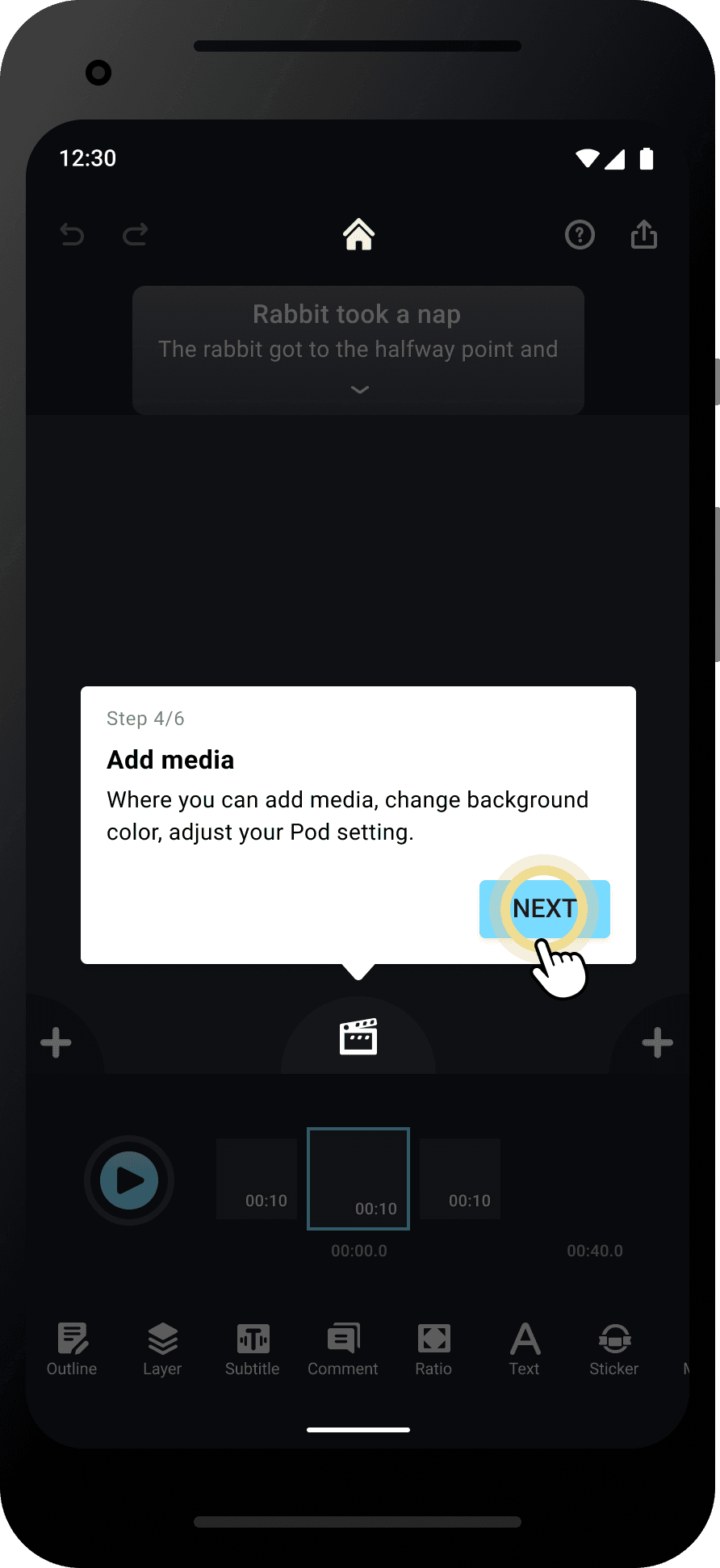
The new onboarding experience walks newcomers through the features with step-by-step guide, in order to help users learn effortlessly and avoid facing frustrations from self-exploration.
Completion and Guidance Recall
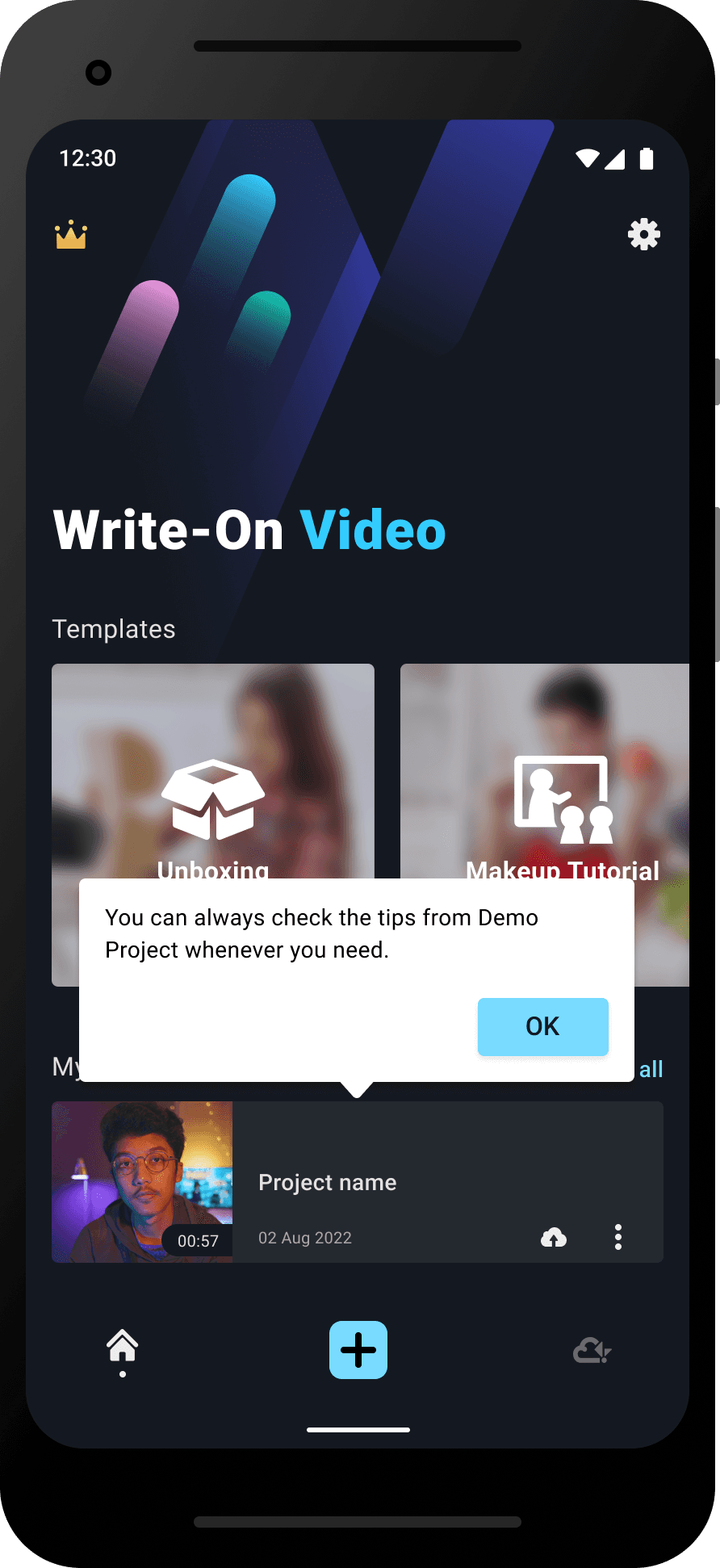
After completing all the steps, users receive a positive completion message. A demo project with helpful tips also acts as a reference guide, to avoid frustrations before they get familiar with the features.


Why We Started
The Product Manager noticed that the retention rate remained low despite thousands of new installs every week for the past 3 months. To understand why this was happening, I dug into app reviews and user feedback and discovered that new users were struggling to learn the app's features quickly, which could lead to low retention rates. Further analysis of onboarding completion data revealed that, despite having a 23-second onboarding video explaining the app's value, users were skipping it after only 2 seconds on average. This data, along with the user feedback, suggested that the onboarding needed improvement.
Our Goal
We hope our new onboarding experience empowers new users to complete their first video project and continue creating with ease. To measure this success, we've established the following key metrics:
20%
Increase the new users’ project completion rate by 20%
10%
Retention rate increase by 10% after a month
Onboarding Journey Audit
To further investigate user friction points, I took the initiative to conduct an audit of the user onboarding journey. This audit revealed a critical issue: because newcomers tended to skip the onboarding video, they were left to explore the features on their own, which could overwhelm them as they tried to grasp all the features while just starting out. I assumed that user friction could be reduced by providing thorough guides:


Market Research
At the beginning of the research process, I audited products that solves the user onboarding problems well on the market to obtain insights and analyze successful strategies, patterns, and trends. Below are some on the stand out insights:

Headspace

Loom

Duolingo

Grammarly

Splice
Duolingo

Users begin trying out the features during onboarding to accelerate learning.
Progress bar visually indicates progress to keep users motivated to complete the onboarding.
Engaging UX copy are applied to convey a friendly word choice and tone.
Grammarly

Clearly delivering the product's value at the beginning of the onboarding process.
Offering a clear guide on each step to help users get started seamlessly.
Having an excessive number of similar screens might overwhelm, fatigue, and frustrate the user.
Headspace
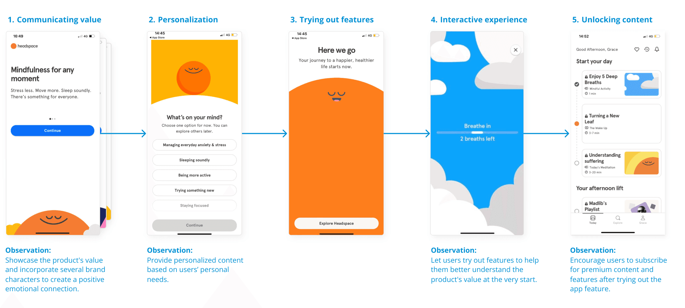
Clearly delivering the product's value with a friendly tone at the beginning.
Encouraging users to try out product features during onboarding to better understand the product's value and promote subscriptions afterward.
Design Tradeoffs
Based on the insights, we had our ideal design — step-by-step guide with UI animations.
However, after discussing the implementation with the product manager and the engineer and considering the time limitations, we decided to go for an alternative design which requires less effort. Instead of using UI animations, we chose to use static (non-animated) UI in the MVP launch to reduce the effort and time involved.
Ideal Proposal

Animated UI guide
The ideal UI would be animated, providing a robust sense of interaction.
Final Decision

Non-animated UI guide
A finger icon has been added to the yellow spot to indicate its clickability and encourage user interaction. This icon is displayed in each step, making it easy for users to follow the guide.
Final MVP Design




Outcome
The MVP project was successfully launched within the planned two month timeline. Due to limited resources and time constraints, we were unable to conduct usability tests before launching the project, so we decided to validate the solution based on market feedback. Unfortunately, due to the company's business decision, we were unable to continue with data collection and gathering user feedback afterward.
Learning
Dealing with constraints like limited resources and tight timelines during this project, I've gained valuable experience in adapting swiftly to different workflows and making quick decisions. These challenges have also deepened my problem-solving skills and enhanced my ability to prioritize tasks effectively.